Moody Hues: How Color Affects Emotions in Art
Ever wondered how Picasso’s ‘blue’ period achieves a melancholic mood, or why Pop art always seems so uplifting and fun? Perhaps you’ve worn a yellow shirt and received compliments about looking cheerful, or worn a dark outfit and been asked if everything was alright? The explanation behind these phenomena is simple yet profound: Color. Color allows us to express our emotions, and artists have honed this skill for centuries—and there’s a scientific reason why this works the way it does.
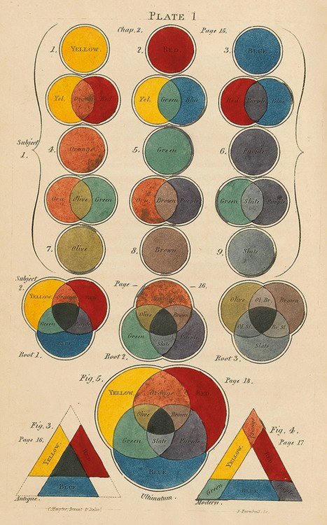
Color psychology explores the impact of colors on human emotion while considering cultural connections, personal preferences, and moods. It draws from color theory, a book written in 1810 by German poet Johann Wolfgang von Goethe that revolutionized the understanding of colors as they interact with one another.
According to a MasterClass article, Psychology of Color Explained: What Is Color Psychology?, Sir Isaac Newton discovered the color spectrum and its scientific properties, but it was not until the twentieth century when Swiss psychiatrist Carl Jung explored the effects of color on the human mind, leading to a method to express emotions through color.

According to Centre Colours, the following is true for colors:
Red often represents danger or warning, red is also the color of passion or bravery. Some studies have shown that red stimulates appetite which may explain why it features predominantly in many food and drink brands.
Orange Warm and stimulating, orange is considered an energetic color. It is also attention-grabbing and used for important content like traffic signs.
Yellow The ‘happy’ color, yellow is associated with optimism, sun, and warmth. Paradoxically yellow has been shown to irritate the eyes which could explain why it makes some people feel uneasy.
Green is associated with the environment and nature, as well as money and good luck, green has a similar calming effect to blue hues.
Blue is said to have a calming effect, blue is often used in offices as it can increase productivity and creativity. Some studies have found it can even lower body temperature and pulse rate.
Violet is associated with wisdom, creativity, and magic, Violet also denotes royalty and luxury and is used by many brands who wish to make their products seem exclusive.
Of course, this list is not the end all be all of the color associations, however, when reading through each color description, I found myself nodding in agreement. However, I couldn’t help but wonder how much of these color descriptions are ingrained, and how much of my preconceived notions about colors are innate. If I had a clean slate, with no cultural background, would I still think red was the color of warning or passion? Would I know that blue is sad?
While the answers to these questions remain unknown, the nature vs. nurture debate on color theory has raged on for centuries and continues to be contested today. While the ongoing debate leaves us questioning exactly how colors have their meanings, it also offers space for fresh perspectives to enter the color association conversation.
One article The Psychology Behind Shapes & Colors written by Rob Postema states, “The meaning of a color can be learned or be biologically innate and can vary depending on the color's shade, tint and hue.” So while the associations of color’s shades, tints, and hues remain up for discussion, one thing is certain: The strong cultural influence of color psychology is challenging to detach from our preconceived color notions, so, we turn to art.
Artworks are products of their cultural context—their colors—and associated meanings can be analyzed to gain further insight.
Red
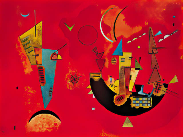
Wassily Kandsinky’s Mit Und Gegen comes immediately comes to mind when thinking about vivacious red paintings. This artwork uses a vivid red base to simultaneously portray a sense of warning, excitement, and chaos. Kandinsky reflecting on his work, noted that “the color red takes on a new meaning when coupled with various other hues. When it’s paired with black, red takes on a more sinister appearance while it becomes a warm, welcoming color when it is used in conjunction with yellow.”
Orange
Jordan Casteel’s painting Direct Response represents Orange as attention-grabbing, like a traffic sign. This oil on canvas is immediately captivating. The subject wears an orange work jacket, serving as a protective safety measure. Casteel skillfully incorporates these orange hues throughout the painting, asking the viewer to remain alert, unlike the sleeping subject.

Yellow
Gustav Klimt’s The Kiss is an unforgettable example of yellow-laced brilliance. Klimt portrays a loving couple, embraced in an intimate embrace. The use of the color yellow in this sense acts as a protective shield, placing the embracing figures in the foreground with a sickly, potentially harmful green color behind them. In the yellow protective shield, the figures are safe and euphoric, sheltered and content with each other.

Green
Green tea by Leonora Carrington evokes verdant ties to nature, money, and tranquility. Carrington’s paintings possess an irresistible allure, capturing the mysterious and naturalistic sentiment of Green. The scene implores the viewer to escape outdoors and reconnect with the organic world. Carrington simultaneously warns us of the consequences of forsaking the earth—the impending doom of civilization lurks in the background.

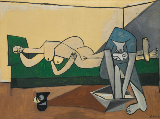
Blue
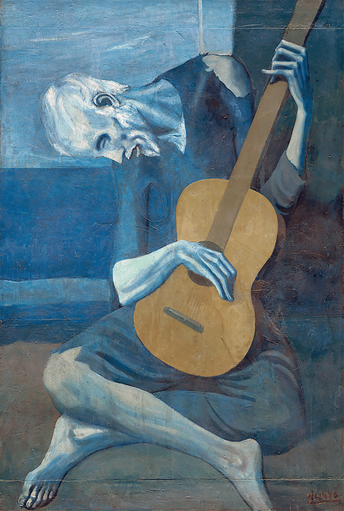
Picasso’s Old Guitarist is the embodiment of blue. The entire canvas is layered with azure hues, reflecting the melancholic feel of the work. The figure’s sadness is evident while he bends over the guitar, holding it close like a dear companion. His gaze lands forlornly just beyond the instrument, and the viewer is compelled to reach through the canvas and console him.
Violet
There is truly something whimsical, even magical, about purple art. Contemporary artist Olafur Eliasson creates enchanting, interactive artworks, using purple-violet color pops to do so. His 2011 installation at the ARoS art museum in Aarhus, Denmark, titled Your Rainbow Panorama, features a rainbow of colors in a walkable installation, and the violet section of this rainbow pictured below truly pops.

While the visual analyses of each work of art did not exactly challenge my preconceived notions of color in art, it was a fun exercise and proved even further that color is a powerful artistic tool. Today, while wearing a brightly colored floral dress–I perhaps mimic the sunny, breezy summer day we’re having. And, I have to say, I’m feeling bright inside and out. Maybe tomorrow I will wear dark colors from head to toe, and see if it changes my mood. But the question remains, how much of this color influence is nature versus nurture?
Moods in art and color are deeply connected. If the influence of color and influence is apparent in art, it is similarly playing a role in our clothing, accessories, and day-to-day interactions with marketing ads and social media. From the vibrant warmth of reds, oranges, and yellows to the serene tranquility of blues, indigos, and violets, colors exist as a prominent visual language that persuades us in ways we may not even be aware of. Artists use this color language to evoke emotions, set the scene, and influence viewers. As viewers, we actively participate in this ever-expanding dialogue.
As we continue in this fascinating exploration of color in art, it is important to remember the power color holds–and further reflect on how it influences our feelings and decisions in our own lives. When pondering an art piece and the feelings it evokes, take a moment to think: Is this color really making me feel this way? Or have we given it the ability to do so? What if the cultural implications of the colors were irrelevant? Challenging normative beliefs and envisioning possible alternatives is a great way to expand the imagination (perhaps blue becomes a warning color, and green is the color of love). Deliberately considering the implications of colors is an intriguing approach to analyzing colors and the meanings we have given them.
©ArtRKL™️ LLC 2021-2023. All rights reserved. This material may not be published, broadcast, rewritten or redistributed. ArtRKL™️ and its underscore design indicate trademarks of ArtRKL™️ LLC and its subsidiaries.