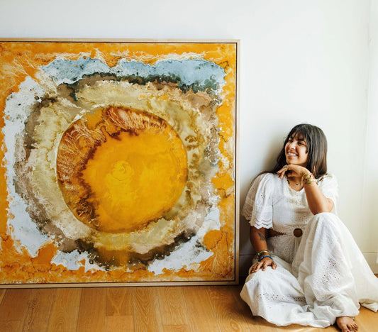
Exploring Art, Color, Coding & Data with Visual Data Scientist Blake Robert Mills
Last month, data scientist Blake Robert Mills launched carefully coded and curated “color packages.” The packages provide visual landscapes of colors used in artworks on display at the renowned MoMA & MET Museums in New York. First launched on X (formerly Twitter), these color packages effectively bridge the gap between the data science and arts communities through cutting-edge data visualization, existing as a potential new tool for museum and interior decorators. I got the chance to speak with Blake, and here’s what he had to say.

Tell me a little bit about your background and anything else you may want to share with our readers.
My background is in political science and statistics; that is technically what I got my degree in. I focus on data for cities. I really like working with research nonprofits and government agencies to make data more usable and accessible, but most importantly, to make it more understandable. That is where my data visualization sneaks in. Information communication is challenging, and I think that a lot of people just think it is something you are born with–like art, you either have it, or you don’t, but that is really not the case. There are ways you can get better at it and learn how to think about things to make data visualization accessible to everyone–making sure it is visually engaging so that people want to see the information.
So, that is how I snuck into data visualization specifically. This project came about–it is kind of funny–it came about due to procrastination. I had done a lot of data visualization, a.k.a “Data vis” projects, using artwork to inspire the color schemes, and I was working on a final for one of my classes. I did not want to write the paper, I just wanted to do the visualizations and had the idea to make my own color palette package for the project.
In a light-hearted manner, Blake revealed the paper was turned in on time, along with an outstanding color visualization package!
I discovered your color palettes on X (Formerly Twitter). Can you define this project?
It is called a package. I code primarily in a coding language called R, and everything is open-sourced, so anybody can make a package, and each package is essentially some collection of information and functions that are interpretable packages other people can then use. Mine is technically just the palettes, but I have also written code to work with the main data visualization areas.

For our readers, can you describe your project and its purpose in your own words/elaborate on the information and how you want people to utilize this package moving forward?
There are two sister packages, if you will, the MoMA package and the MET package. They are both collections of palettes for data visualization or any sort of generative art, based around art at those respective museums. It is pretty comprehensive in terms of medium, time period, and purpose. The MoMA package is focused on more traditional painting and sculpture, whereas the MET package highlights historical pieces and vases from the New Kingdom of Egypt and treads that line of museum art and historic objects.
The intention is that people use these packages for their data visualization. There’s not a deficit or a small number of pallets available to people, however, quite a few pallets have their strengths and weaknesses. I’ve tried to bridge a lot of these gaps by thinking through how they can be used and how they can be accessible to people who have various forms of color deficiencies, so a lot of them I’ve tried to make them colorblind-friendly.
As a broader goal, I’d like to remind people that inspiration can come from anywhere and that this sort of thing can really be thought of however you want–inspiration can come from the Hudson River if it's pretty enough and engages you. So, just thinking about using the world about us to inspire our work.
Along this same vein, what is your background in art? How has your background in the arts influenced your packages?
I do not have any formal art training—Columbia requires us to take one art class during our time there, so I now have some knowledge in how to break down art critically. In terms of why I was drawn to certain paintings, I think I just found inspiration during my visits to these museums. I'm originally from Nebraska, and I moved to New York City for college. My town had a population of 35,000, and then I moved to Morningside Heights, where the population of the neighborhood was the size of my hometown. I think when anyone moves to the city, they find ways to ground themselves in such a chaotic environment. For me, that was going to the MET. It was a way for me to walk around, it was so peaceful to see the art and light–to do all of that was just a breath of fresh air for me. Walking around all of the time influenced my perspective and knowledge of art. I’ve always been drawn to it, but having that ability to go in and explore allowed me to dig into the art world.

Can you explain the inner workings of your project to those of us who do not code?
The first step is to select the artwork. I usually do that manually–you have a sense of what will make a good color scheme and what will not. I then upload them into my coding language. I’ve written code to extract the top colors (in the foreground) and most contrasting colors to make a nice stark color scheme. From there, I get anywhere from five to 20 colors; the next step is more manual.
I am a firm believer in this concept in data science called “Human in the Loop,” which is that usually, in machine learning, you do not want the computer to do everything because if humans are using it, humans need to be able to interact with it. So, this is my way of being the human in the loop. I then go through and decide which colors should stay, and which can be discarded based upon their significance in the chosen artwork.
In this step, I also do some photo editing like increasing saturation or brightness to get more distinction between the colors to make it more usable. But probably, the more important reason for this is to adjust the algorithm to be colorblind friendly, as most of my pallets are. I think this step also sets my project apart, the extra step to ensure the packages are colorblind-friendly!

I find your project intriguing because it is a direct intersection of arts and data science. The data science community seems extremely excited about your product & approach—how might you think the arts community will respond to your design? Do you see a scenario where a museum might include this in a curatorial setting?
The data community responds to it well because there are a lot of technically skilled people who may lack that art background, so they are excited to bridge that gap. I do think the art community is getting more excited about data and generative art and how we can use technology to produce art. There will always be an interesting conversation surrounding how much is original versus how much is just copied.
In my MoMA project, I used art from Sheri Levine, who was known for breaking down paintings into 16 colors. I then turned those into eight colors; it is getting very meta at this point.
I have an interesting relationship to my project as a data or art concept, but I think the line is blurring so much at this point that it almost doesn’t matter. One of the beautiful things about this specific project is that it is up to the user whether they want to use it for art or data or both, or maybe neither! Personally, my sister likes to use the palettes to base her interior decorating around them. So yeah, they are very versatile!
I think this is, hopefully, a fun way to understand that the data community is also approachable. Just like any data vis person can get into the arts, any art person can get into the “data vis” world and play with it and just have fun.
Blake’s response directly parallels how a viewer decides what a work of art will mean for them. It's up to the beholder to decide.
How do you plan on expanding this project going forward? Do you have any similar ideas you are exploring at the moment?
In terms of the specific project and expanding it, I am always down to do more museums, and if any museum asks me to recreate another version of these packages, I would love to do it.
In terms of the next steps, I have been working on a project to include more data from the museum itself—not just colors, but information too. I think right now, the project is a tool to improve data visualization or communication, but I would like to use museum data to explore color as data. I think it is a unique perspective, and generally, when people think of data, they think of words or data or Excel sheets, but anything can be data if you make it–so, in my case, color is the data!
©ArtRKL™️ LLC 2021-2023. All rights reserved. This material may not be published, broadcast, rewritten or redistributed. ArtRKL™️ and its underscore design indicate trademarks of ArtRKL™️ LLC and its subsidiaries.