
You’ve heard about art books, but what about books that look like art? Book covers are more than just a pretty picture—they are often a glimpse into the characters, settings, themes, and motifs. Sometimes, authors will use a cover to grab a reader’s attention using an illustration that does not make sense until the story ends.
There is a reason people say don’t judge a book by its cover. But some people tend to gravitate toward book covers that attract them regardless of their plot. Authors sometimes create book covers that truly match the story, filling an unknown emptiness. Here are 10 book covers that not only fill that void but should also fill gold-plated frames in a museum.
Cleopatra and Frankenstein by Coco Mellors
The cover of Mellor’s humorous yet devastating novel is a symbol of the trials and tribulations Cleo, Frank, and other supporting characters experience after their rushed marriage is finalized. Mellor used Cleo as her Hippocrene for the cover, illustrating a woman with a black eye— possibly hinting at domestic abuse and the abuse life throws at her during her labyrinthine marriage. Paula Rego depicts a similar pain in her painting “Love” (1995). The woman lay there with a hurtful yet blank stare, akin to Mellor’s cover.
While the title may seem enticing, Cleopatra and Frankenstein is unfortunately not a love story about Cleopatra VII Thea Philopato and Frankenstein’s monster. Rather, it is a love story about Cleo, a British 24-year-old painter living in the craziness of New York City. There, she meets Frank, and 20 years later, he obtains all the success she longed for. Frank offers a proposition to Cleo: a quiet life to paint, relax, and gain American citizenship. Before they know it, their impulsive marriage irreversibly changes their lives and those around them.

TW: Mentions mental illness, drug and alcohol abuse, domestic abuse, and addiction.
Eva Luna by Isabel Allende (Spanish Edition)
Without context, this cover is, well, confusing. It is a Mod Podge illustration with a cubism-adjacent face, and fiery red hair all attached to the body of a panther. You could easily identify this cover as a combination of surrealism and cubism artwork. It is unsettling but also has familiar features. Eva Luna carries the reader through Eva’s life in Chile, trading stories with eccentric characters from all different backgrounds. Allende's novel often focuses on imagination, explaining the uncanny and rather unsettling cover.
Publishers often translate books into different languages so that a book can be universally enjoyed and accessible to a larger audience. Isabel Allende’s original Eva Luna edition does not feature this cover, but the Spanish edition does. Many other authors have replicated this, denoting the original version from other editions.

The Inugami Curse by Seishi Yokomizo
Authors sometimes use mystery and curiosity through their book covers to appeal to an audience. Seishi Yokomizo’s The Inugami Curse features a rather perplexing piece of artwork. What are the legs poking out of? Why? What is the significance of the colors? All of these questions are akin to those you may ask yourself on your next trip to a museum.
Similar to artists, Yokomizo’s book covers are all relatively similar in format. This is a visually pleasing way to establish a signature style for viewers to identify. Van Gogh’s brush techniques are a key indicator of his paintings. Yokomizo’s covers are similar in the same way. Even if you remove his name and title from the book cover, avid book readers could still identify that the novel belongs to Yokomizo.

The Hobbit by J. R. R. Tolkien
Like many uber-successful books, The Hobbit has many cover variations, all depicting different aspects of the storyline. This original cover is rather evocative of the iconic woodblock print The Great Wave of Kanagawa by Hokusai with similar color-blocking and simplicity. The iconic print is displayed at the Museum of Fine Arts in Boston.
Known as one of the most iconic franchises of all time, The Hobbit is the prelude to The Lord of the Rings where J. R. R. Tolkien introduces readers to the world of Middle-earth, dwarves, and mystical dragons. Written in 1937, the original Hobbit book cover illustrates a simple landscape portrait, giving readers a glimpse into Tolkien’s fantasy world.

Normal People by Sally Rooney
Sally Rooney’s Normal People book cover has many iterations, including this one painted by Kate Ryan. Although authors always have some form of reasoning behind book cover choices, some fans were disappointed in Rooney’s original design. Whether created by Rooney herself or the fans, Normal People alternative covers shed a deeper light on the characters’ relationships.
This alternative cover illustrates the intimacy between the two main characters, Connell and Marianne. However, they keep their relationship private for fear of what their classmates would say. Thus, their embrace is a keystone to the storyline since their intimacy is rarely publicly revealed. Ryan placing their secret rendezvous on the front cover is the epitome of a great book cover. It contradicts Marianne and Connell’s relationship, emphasizing a deeper meaning that one only understands when the book ends.

TW: Mentions child abuse, domestic abuse, sexual assault, and alcohol abuse.
The Death of the Heart by Elizabeth Bowen
The Death of the Heart book cover captures Portia, a young, awkward girl, holding onto a door that appears to be inside an elevated and lavish home. The juxtaposition between her overall dark tones and the bright blue and shimmering gold of the wall and door point to the book’s time. It is 1918, the world is going to war, people are dying, and Portia is focused on love and romance. Portia’s features are painted in a Neoclassical technique where somber colors, straight lines, shadows, and highlights are prominent. In addition to the Neoclassical theme, Bowen’s book is reminiscent of Elisabeth Louis Vigée Le Brun’s Julie Le Brun as a Bather (1792). Both portray a young girl who exudes sadness through their facial expressions and the use of thematic somber colors.

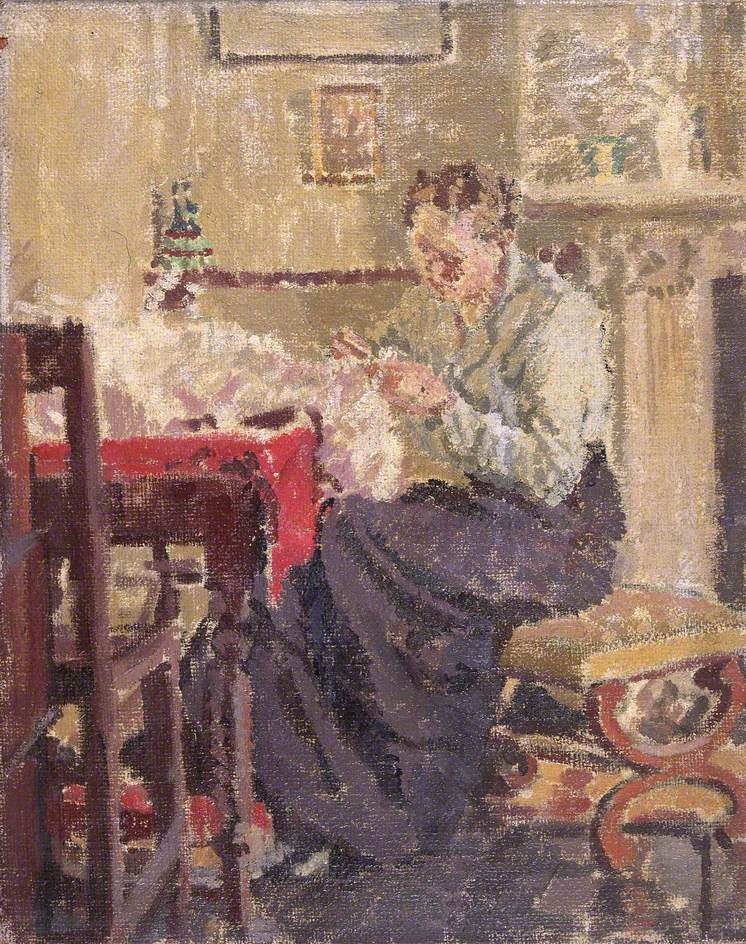
Women In Love by D. H. Lawrence (Paperback)
If there is one thing I know to be true, it is that a woman’s love is complex, delicate, tender, and infinite. The depiction of intimacy between a man and woman on the cover of D.H. Lawrence’s Women In Love encapsulates what a woman’s love looks like. The somber yet beautiful portrait of the main characters, Gerald and Gudrun, illustrates a simple human connection. The colors used to depict this interaction highlight what Gerald and Gudrun’s relationship turned out to be—an unstable union, a tumultuous storm. Laura Sylvia Gosse’s The Seamstress (1914) uses a similar color palette and painting technique where brush strokes are purposefully noticeable and blending is an afterthought.
The 1920 book tells a tale of the two sisters, Gudrun and Ursla, and their romantic endeavors with two men, Rupert and Gerald. Infamously, you can’t have love without a little heartbreak. Lawrence’s cover highlights the character’s love so agonizingly beautiful.

Venus and Aphrodite by Bettany Hughes
While each has their own individual differentiating qualities, Venus and Aphrodite are famously associated with love, beauty, and lust. Ann Kirchner designed the book cover and took inspiration from ancient Roman paintings and sculptures. It is unknown if the woman is meant to be Venus or Aphrodite, or maybe even both. Regardless, the cover is a portrait you could easily envision displayed in a museum. Artists have been creating interpretations and depictions of gods and goddesses for centuries, each one representing a feeling, element, or thing.
Bettany Hughes’ Venus and Aphrodite is a biography of human desire told through stories of ancient art and mythology.

The Anatomy of Melancholy by Robert Burton (modernized)
The Anatomy of Melancholy has used many book cover variations, especially since new alterations were made and republished from 1621 to 1651. However, this cover specifically, used for the eBook edition, is a modernized version with a Neoclassical-style painting of a woman. The depiction of light and somber color palette points to this art movement while also hinting at the book’s initial time period.
Originally published in 1621, Robert Burton’s The Anatomy of Melancholy explores the psychology behind human emotion, mainly unexplained sadness. Now, in 2023, society has modernized enough to recognize this phenomenon as a symptom of depression. Prior to technology and advanced science, people, including Burton, believed these emotions were derived from mythical third parties such as demons, witches, and Gods. More editions were published due to further research in 1624, 1628,1632, and 1638, and finally, the last edition was published in 1651.

Blood Moon by Patricia Kirkpatrick
Unlike Burton’s modernized cover, Patricia Kirkpatrick’s Blood Moon cover leaves more to the imagination as to what the book is about. The simple design and lack of detail contradict Kirkpatrick’s poetry. The cover’s design is in a continuous line art style where the artist never or rarely removes his pen from the paper. Pablo Picasso has similar pieces where the drawing is all in one line. Lying Female Nude is a sketch Picasso created in 1932 that lacks detail but evokes much emotion, just like Kirkpatrick’s book cover.
In Blood Moon, Kirkpatrick examines the obstacles a woman, specifically a woman of color, endures in her life. From racism to whiteness to language, Blood Moon captures the phases women go through during a lifetime, similar to a moon. Kirkpatrick’s message to her readers is that after every phase of our lives, after all the scrutiny and discrimination, “The moon will be there.”

BONUS: Conversations with Friends by Sally Rooney
This bright portrait of two women is a real painting by Alex Katz called Sharon and Vivien (2009). Fans of Rooney have debated who the characters are meant to represent but, like most art, the interpretation is determined by the viewer.
Oftentimes, authors will use real paintings for a book cover because it either is incorporated into the book or is a visual representation of the main character. Conversations with Friends by Sally Rooney tells the story of two friends, Frances and Bobbi, who meet a couple, Melissa and Nick. As the four characters begin to form bonds, emotions develop that lead to infidelity.

©ArtRKL™️ LLC 2021-2023. All rights reserved. This material may not be published, broadcast, rewritten or redistributed. ArtRKL™️ and its underscore design indicate trademarks of ArtRKL™️ LLC and its subsidiaries.


